


 “All religions, arts and sciences are branches of the same tree. All these aspirations are directed toward ennobling man’s life, lifting it from the sphere of mere physical existence and leading the individual towards freedom.” –Albert Einstein
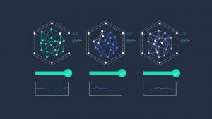
Unlike the the olden times when people conscientiously drew artwork by hand, the digital age is more like letting your mind soar into the depths of la-la land where art and science are one and the same, letting contemporary technology help you visualize your ideas. Presenting facts and figures through digital artwork is the essence of data visualization, and we have big data to thank for its beauty.
In Pasadena, the ‘Worlds’ exhibit at the Art Center College of Design further emphasizes the nexus between art and science. Their displays include art, historical documents and visualization of scientific data that bid to justify the role of scientific knowledge in human’s understanding about the world.
Big Beautiful Data
 One of the goals of visualization is to present data in an artistic manner. An example of this new presentation motif is Eric Fischer’s “See Something or Say Something.” It charts global data from Flickr and Twitter, which makes for an intricately-designed map that elegantly shines in hues of orange, blue and white. At first glance, you might mistake them for interstellar space bodies, but the dots are actually representations of tweets and photos with location data from Twitter and Flickr. Here’s Fischer explains how he did it:
“There’s not a whole lot of technology behind it. It’s a C program that runs through the photos/tweets in chronological order, plotting the earliest ones the most brightly and stepping the brightness down for points that don’t show up for the first time until later on. Points are also allowed to diffuse by a few pixels when there is an additional record for a point that is already plotted, with the brightness falling off exponentially as the point that is actually plotted gets further from its intended location. Each pixel is the somewhat weird area of 2.25 square miles because a smaller area made the whole-world image too big for Flickr to let me post it.”
 Another beautiful piece of artwork is from Facebook’s engineering intern Paul Butler, who mapped the social network’s worldwide friendships in different shades of fine blue lines. Since it’s on a global scale, it’s impossible to trace individual connections. However, the thicker the blue lines, the stronger the connection between the two distances. The rather intriguing spots on the map are the dark spots, which are areas Facebook has yet to reach. Who knew there were corners of the world that haven’t been infiltrated by Facebook!
“I defined weights for each pair of cities as a function of the Euclidean distance between them and the number of friends between them. Then I plotted lines between the pairs by weight, so that pairs of cities with the most friendships between them were drawn on top of the others,” explains Bulter about his piece.
“I used a color ramp from black to blue to white, with each line’s color depending on its weight. I also transformed some of the lines to wrap around the image, rather than spanning more than halfway around the world.”
Flavors of the world
 Here’s another interesting look at global behavior, and it’s pretty tasty. Yong-Yeol Ahn and company visualized a flavor network. Food flavors fluctuate based on culture and geography, and this art piece breaks down ingredients into flavor compounds to examine what the ingredients had in common, comprising the Flavor Network.
“Each node denotes an ingredient, the node color indicates food category, and node size reflects the ingredient prevalence in recipes,” says Ahn. “Two ingredients are connected if they share a significant number of flavor compounds, link thickness representing the number of shared compounds between the two ingredients. Adjacent links are bundled to reduce the clutter.”
It’s amazing how global data can be presented artistically, so that we gain new perspective towards understanding the facts behind the trends of globalization. Sometimes it’s enough that they’re visually delightful, making us truly wonder at our own place in this worldwide network of ours.
THANK YOU