


 Data has come to our aid in many ways. On top of presenting figures in a more convenient manner, understanding the data allows us to draw out conclusions and further, make predictions to prevent missteps in the future. Healthcare’s been a sector that’s really resonated with the consumer population, bringing big data to the forefront of our every day lives.
Identifying the killers
One of the rather perplexing healthcare matters today is the existence of healthcare-associated infections, as stressed in this infographic. These infections are also called unknown killers, for having affected millions of people and adding billions of dollars to annual healthcare costs in the US. Those admitted to a hospital have a 5 percent chance of contracting HAI, and this will lead them to increase their hospital stay by an average of 17.6 days. There are 1.7 million people that get infected every year, and 98,987 of them die.
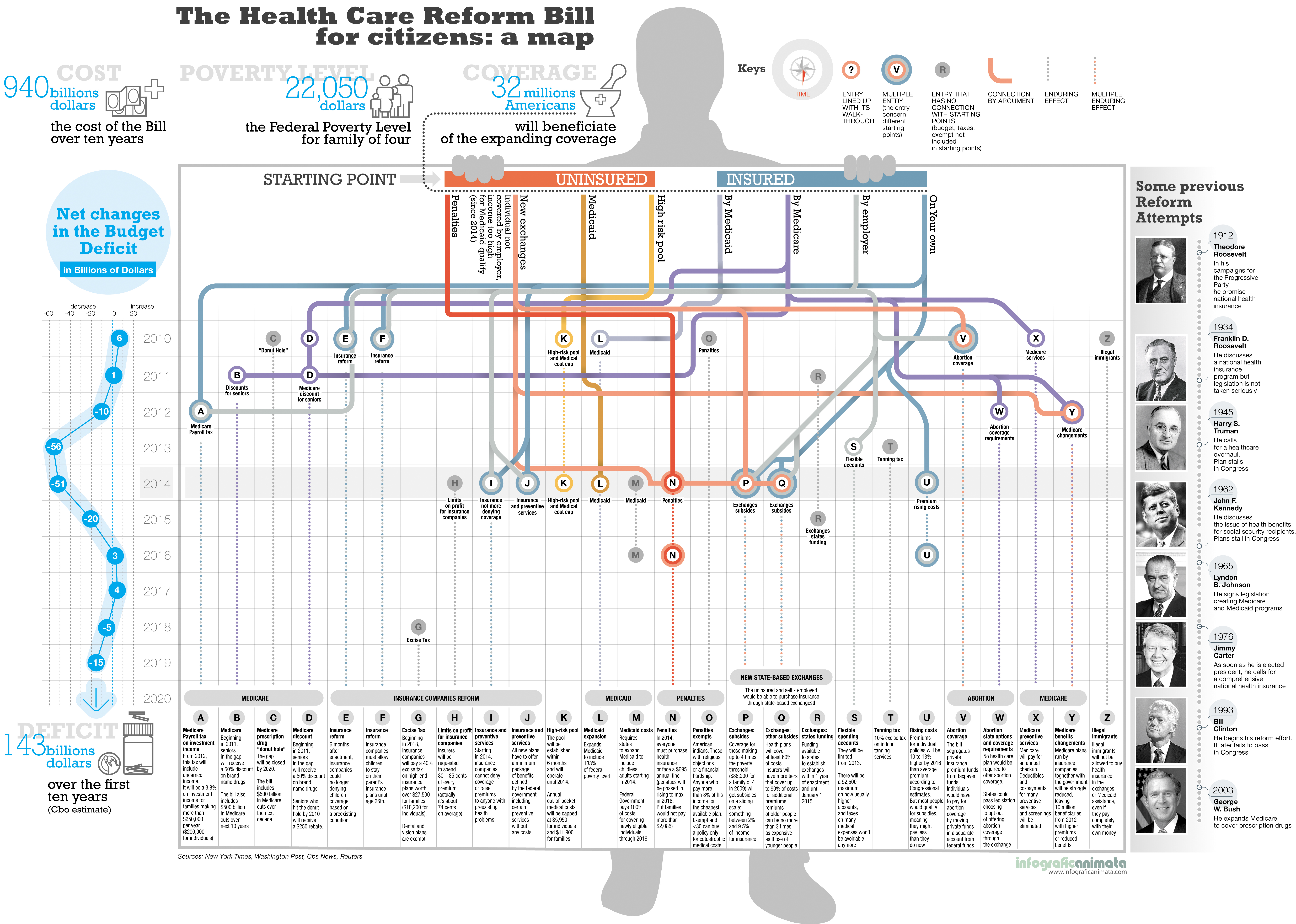
The cost of care
 But perhaps the biggest issue about getting sick is the cost. In President Obama’s Patient Protection and Affordable Care Act, the American health care system is reformed and all citizens get the insurance that they need. This move is where previous leaders like FDR, Truman, Nixon and Clinton had been unsuccessful. However, this doesn’t mean Obama’s healthcare reform is out and out perfect. Yes, it has advantages, but it’s got its share of downsides as well. After all, the American political system believes that there is no progress without compromise. There’s a conflict between growing demand and growing costs. Check out the story in its entirety here. Also, props to the artwork that animated the factors involved. Indeed, this piece of data visualization is a nifty one.
Changing the system
 Aside from political and business pressure, the previous healthcare system bears a lot of burden as chronic diseases such as cancer, diabetes, heart disease, hypertension, strong, mental disorders and pulmonary conditions keep coming. These diseases can otherwise be prevented or managed cost-effectively at its early stage, but the government chooses to treat chronic diseases over long term. Changing the system was a viable reason after all. Here’s a map from GE that shows the spiking of cost in treating chronic diseases from 2003 to 2023 if it were to continue.
Since President Obama is a democrat, here’s the Organization Chart of the House Democrat’s Health Plan. The infographic details the inflow of money within the healthcare business.
Support our mission to keep content open and free by engaging with theCUBE community. Join theCUBE’s Alumni Trust Network, where technology leaders connect, share intelligence and create opportunities.
Founded by tech visionaries John Furrier and Dave Vellante, SiliconANGLE Media has built a dynamic ecosystem of industry-leading digital media brands that reach 15+ million elite tech professionals. Our new proprietary theCUBE AI Video Cloud is breaking ground in audience interaction, leveraging theCUBEai.com neural network to help technology companies make data-driven decisions and stay at the forefront of industry conversations.


