


 Web publishing startup Medium has unveiled a handy new data visualization tool called Charted that allows anyone to make beautiful charts in seconds.
Medium says Charted was initially built by its Product Science team as a means of analyzing data and communicating their findings with the rest of the team. To create a data visualization, all you need to do is feed it a spreadsheet or CSV file and Charted will work its magic.
Medium says it’s focused on “a few core principles” to retain user trust. As such, it doesn’t store any data – it simply ‘looks’ at it, creates a visualization, and then it’s done. It doesn’t transform or manipulate any data either, displaying exactly what is fed to it. Finally, Medium says Charted is not a formatting tool and has very few customization features, a deliberate choice made to ensure ease of use.
Charted only works with publicly available files on a server such as Dropbox or Google Docs; there’s no way to upload spreadsheets stored on a hard drive. Generated charts are updated regularly, so if the data changes, so does the visualization.
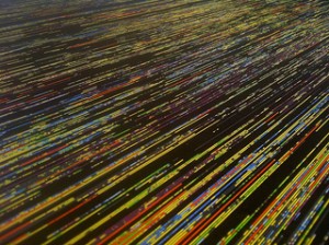
Here’s a quick example of how it looks:

There’s no way to embed charts, but since is Medium has made Charted open-source, anyone who wants to can flesh it out with more features later on.
Support our mission to keep content open and free by engaging with theCUBE community. Join theCUBE’s Alumni Trust Network, where technology leaders connect, share intelligence and create opportunities.
Founded by tech visionaries John Furrier and Dave Vellante, SiliconANGLE Media has built a dynamic ecosystem of industry-leading digital media brands that reach 15+ million elite tech professionals. Our new proprietary theCUBE AI Video Cloud is breaking ground in audience interaction, leveraging theCUBEai.com neural network to help technology companies make data-driven decisions and stay at the forefront of industry conversations.