


 APPS
APPS
APPS
APPS
APPS
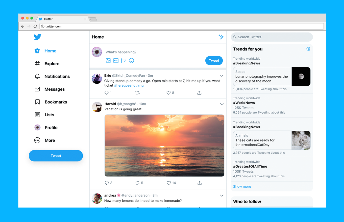
Twitter Inc. today started rolling out a refreshed version of its desktop website that brings an entirely new interface, simplified navigation controls and more customization options for users.
The update marks the service’s first major redesign in seven years. It’s the fruit of a nearly two-year development effort that saw Twitter not only overhaul the interface but also merge the desktop site’s code base with that of the mobile version. The result, the company said, is a unified architecture that will make releasing future enhancements easier.
Twitter spent 10 months beta-testing the redesign ahead of today’s launch. The perhaps biggest change is that the new interface moves Twitter’s navigation buttons from the top to a large sidebar on the left of the timeline. The sidebar provides quick access to sections such as the Explore tab, Notifications and Messages alongside with several new features.
The Explore tab works somewhat differently than in the old site. Its primary function is still to aggregate popular tweets and hashtags, but Twitter plans to mix up the content by adding in more live video, as well as local content recommended based on the user’s location.
The Messages view has been thoroughly reworked. Instead of showing up in a small window atop the timeline, direct messages now have their own dedicated section that resembles an inbox. It’s split up into two panes: messages are listed in the left box and conversations are on the right.
The new navigation sidebar flanking the timeline also includes shortcuts to lists and bookmarks, which users could previously only access from the profile page. Capping the shortcut list is a “More” button that brings up a dropdown menu with secondary settings. These include two dark modes, “Dim” and “Lights Out,” plus interface customization options that make it possible to change the text size as well as adjust certain color settings.
To top it all off, Twitter took the opportunity to introduce a couple of usability improvements for power users. The search section now shows advanced filters in a new, more accessible sidebar on the right, while a new navigation option allows users with multiple accounts to switch among them quickly.
Woah, what’s this? A shiny new https://t.co/q4wnE46fGs for desktop? Yup. IT’S HERE. pic.twitter.com/8y4TMzqBGa
— Twitter (@Twitter) July 15, 2019
Support our mission to keep content open and free by engaging with theCUBE community. Join theCUBE’s Alumni Trust Network, where technology leaders connect, share intelligence and create opportunities.
Founded by tech visionaries John Furrier and Dave Vellante, SiliconANGLE Media has built a dynamic ecosystem of industry-leading digital media brands that reach 15+ million elite tech professionals. Our new proprietary theCUBE AI Video Cloud is breaking ground in audience interaction, leveraging theCUBEai.com neural network to help technology companies make data-driven decisions and stay at the forefront of industry conversations.