Instagram gets a makeover including new logo and design changes
Facebook-owned photo sharing app Instagram has had a makeover that includes a new logo and changes to the design of the app itself.
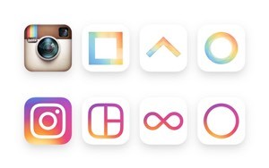
The changes include the once iconic Instagram brown camera logo being abandoned in favor of a colorful, fresher design that includes hues of purple, pink, red, orange and yellow, paying homage to the previous design by including a camera glyph while delivering a more modern, friendly look.
“The Instagram icon and design was beginning to feel, well… not reflective of the community,” Instagram head of design Ian Spalter explained in a post on Medium,”and we thought we could make it better.”
Beyond the bright new icon, Instagram’s user interface has seen blue text and orange notifications abandoned in favor black text and red notifications.
“We stripped the color and noise from surfaces where people’s content should take center stage, and boosted color on other surfaces like sign up flows and home screens,” Spalter added.
 Same same but different
Whether Instagram desperately needed a new look is arguable, but there was an overall shift with the change, and that was with cohesive unified branding across Instagram and its family of other apps including Hyperlapse, Layout, and Boomerang.
“We carried the gradient through each icon, and designed them on the same grid to make the system feel cohesive,” Spalter explained. “We also updated the Layout and Boomerang icons to better represent what the apps help you create — a collection of photos, or a mini video that loops forward and backward.”
It may be a case of same same but different for Instagram, but a fresh new look for the service certainly can’t hurt it, and comes at a time where a decline in growth and user engagement has resulted in headlines such as “Is Instagram Dying a Slow Death?”
While we know Instagram’s ad take has been growing rapidly, users simply are not engaging with the service as much, not helped by the fact that the number of ads shown is often as many as one in every six images on its timeline.
You don’t have to be a UX expert to recognize that the new look (particularly the app icon) is certainly a lot trendier and youthful than the previous incarnation, but whether aesthetics alone are enough to see Instagram growth and engagement pick up again is anyone’s guess.
Image credit: Instagram
A message from John Furrier, co-founder of SiliconANGLE:
Support our mission to keep content open and free by engaging with theCUBE community. Join theCUBE’s Alumni Trust Network, where technology leaders connect, share intelligence and create opportunities.
- 15M+ viewers of theCUBE videos, powering conversations across AI, cloud, cybersecurity and more
- 11.4k+ theCUBE alumni — Connect with more than 11,400 tech and business leaders shaping the future through a unique trusted-based network.
Founded by tech visionaries John Furrier and Dave Vellante, SiliconANGLE Media has built a dynamic ecosystem of industry-leading digital media brands that reach 15+ million elite tech professionals. Our new proprietary theCUBE AI Video Cloud is breaking ground in audience interaction, leveraging theCUBEai.com neural network to help technology companies make data-driven decisions and stay at the forefront of industry conversations.


