


 BIG DATA
BIG DATA
BIG DATA
BIG DATA
Analytics providers are constantly working to lower the learning curve of their offerings in a bid to reach more users.
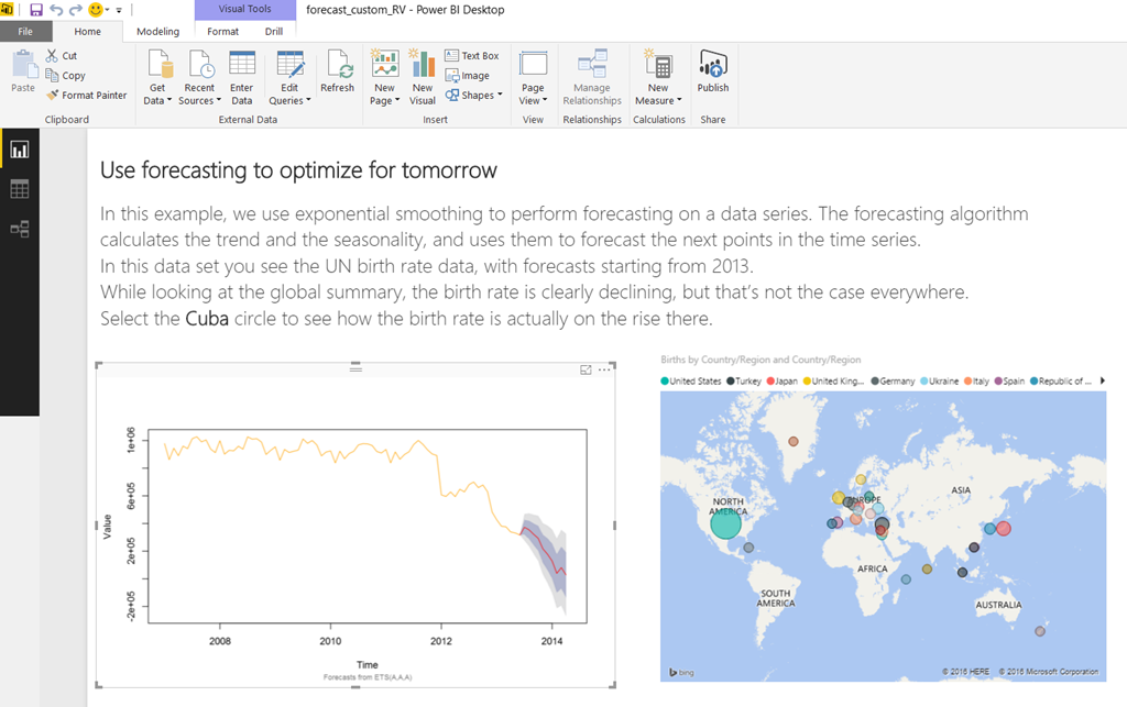
Microsoft Corp. joined the effort this week by releasing a new data visualization feature for Power BI, its cloud-based business intelligence service, that lets analysts create graphs with the R language without having to perform any scripting. Instead, they can use one of the half dozen ready-made dashboards that the software giant has added to its template library as part of the update. Implementing them is only slightly different compared with the company’s standard pre-packaged visualizations.
Specifically, analysts must download Microsoft’s R distribution or the upstream CRAN version if they plan to use the new visualizations on the desktop client of Power BI. After choosing and installing their template of choice, a user can simply fill the empty fields with they data they wish to visualize. It’s also possible to modify the behavior of each graph if needed, but Computerworld’s Sharon Machlis noted that the customization options in the graphical interface are more limited than in the native R language.
The Correlation Plot template, as an example, can’t be made to display specific numbers for metrics if it’s configured to set data patterns in a circular graph. Microsoft will no doubt roll out additional customization option and templates over time.
It’s also safe to assume that R will remain a central part of the company’s analytics efforts given its 2015 acquisition of Revolution Analytics Inc., the main commercializer of the technology. Besides Power BI, the company has also made the language available on its Azure public cloud, added integration with SQL Server 2016 and recently launched a Linux implementation.
Support our mission to keep content open and free by engaging with theCUBE community. Join theCUBE’s Alumni Trust Network, where technology leaders connect, share intelligence and create opportunities.
Founded by tech visionaries John Furrier and Dave Vellante, SiliconANGLE Media has built a dynamic ecosystem of industry-leading digital media brands that reach 15+ million elite tech professionals. Our new proprietary theCUBE AI Video Cloud is breaking ground in audience interaction, leveraging theCUBEai.com neural network to help technology companies make data-driven decisions and stay at the forefront of industry conversations.