


 NEWS
NEWS
NEWS
NEWS
NEWS
 I’ve been searching around today for what the data is saying about the London Riots. My sources: Twitter, Google and The Guardian DataBlog.
The Guardian blog used open data for its riot coverage. Its sources include The Metropolitam Police, the London Fire Brigade, the Association of Convenience Stores and the Twitter account: @Riotcleanup.
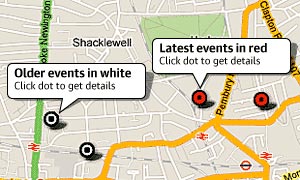
 Matt Stiles is a data journalist for National Public Radio. He created this interactive map with data from The Guardian and Google Fusion Tables.
According to Stiles blog, The Daily Viz, the map shows recent riot locations in greater London as red points. Those red points represent what the Guardian calls indices of deprivation. This essentially means that these areas are more poverty-stricken. Deeper reds on the map represent higher poverty, while blues represent more income.
Here’s a larger view of the map. Stiles used both riot and deprivation data from The Guardian to create it. Crowdsourced riot data is something that has been done before during world events. In this case, The Guardian is using Google Docs that anyone can edit. Here are some of the most recent entries:

Services Angle
Recent world events have helped create a new data medium for making sense of the chaos that comes with riots and wars. We get the qualitative data in heavy doses but it’s the visualization that provides insights into how data services can be used to tell stories that words can not often convey.
Support our mission to keep content open and free by engaging with theCUBE community. Join theCUBE’s Alumni Trust Network, where technology leaders connect, share intelligence and create opportunities.
Founded by tech visionaries John Furrier and Dave Vellante, SiliconANGLE Media has built a dynamic ecosystem of industry-leading digital media brands that reach 15+ million elite tech professionals. Our new proprietary theCUBE AI Video Cloud is breaking ground in audience interaction, leveraging theCUBEai.com neural network to help technology companies make data-driven decisions and stay at the forefront of industry conversations.