


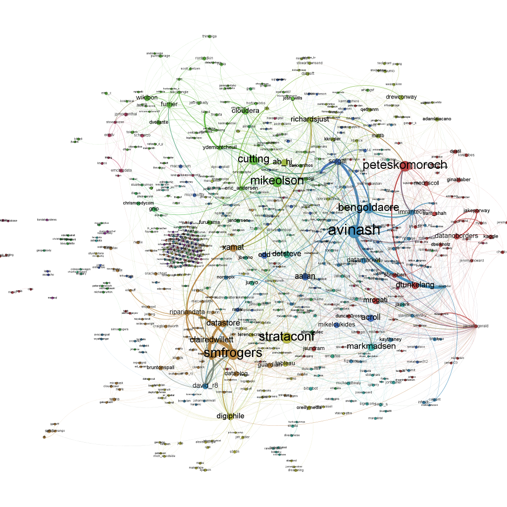
 The data visualization blog Beautiful Data has some great stuff this week from the Strata Conference. The most recent post by Benedikt Koehler features a network map of the tweets from the first day at Strata with the hashtag #strataconf.
You can see on the map how the keynotes play into the Twitter stream. The most tweets go to those keynote speakers.
He goes into detail about how he created the graphic for the developers seeking to create this type of network map. I think it demonstrates the wide range of skills needed to create this kind of work.
But I find the map Koehler did about big data investment of particular interest. He showed the most important companies represented at the conference and their connections via venture capital or investment firms. You can tell from the map that SAP Ventures is backing Jaspersoft. And Revolution Analytics is backed by Intel Capital.
 Services Angle
This year, the Strata conference had an entire track and a tutorial for visualization. But it is still so unknown to most people. I sat down with Noah Ilinsky who wrote the book on visualization. Ilinksy has a Bachelor of Arts degree in Physics and a Master of Science in Technical Communications. Koehler has a PhD in sociology, ethnology and psychology. People like Ilinsky and Koehler are a rare breed. But it is the skills they possess that are most needed.
The data visualization market is a services playground. Vendors present all too often in grids and words. Visualization is what customers need. But custoemrs don’t have the skill sets to do it themselves. Services providers will continue to thrive in this market until that gap can be filled.
Support our mission to keep content open and free by engaging with theCUBE community. Join theCUBE’s Alumni Trust Network, where technology leaders connect, share intelligence and create opportunities.
Founded by tech visionaries John Furrier and Dave Vellante, SiliconANGLE Media has built a dynamic ecosystem of industry-leading digital media brands that reach 15+ million elite tech professionals. Our new proprietary theCUBE AI Video Cloud is breaking ground in audience interaction, leveraging theCUBEai.com neural network to help technology companies make data-driven decisions and stay at the forefront of industry conversations.


