 NEWS
NEWS
 NEWS
NEWS
 NEWS
NEWS
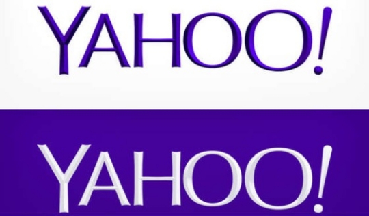
Yahoo! has just unveiled a new logo which CEO Marissa Mayer described as “whimsical, yet sophisticated. Modern and fresh, with a nod to our history. Having a human touch, personal. Proud.”
In all honesty, there’s nothing really special about the logo, other than it’s just a bit slimmer and has a 3-dimensional effect. Though it looks like a bunch of straight lines, Mayer stated in her Tumblr post that it’s not. So what else was considered in creating the new logo?
Mayer enumerated that the team did not want straight lines in logo as “Straight lines don’t exist in the human form and are extremely rare in nature, so the human touch in the logo is that all the lines and forms all have at least a slight curve,”
Instead, the team chose letters that are thicker and thinner in each stroke to convey “the subjective and editorial nature of some of what we do.” The San Serifs font was used once again, while the designers also added some “scallops” on the ends of the letters to make them look more interesting. As for the word “Yahoo”, this is still all caps so it can easily seen even when using mobile devices, the “OO’s” are still playful looking, the exclamation, though slanting is still present, and they’re still using Pantone Violet C for the color of the logo.
There’s a video that details the changes in the logo, including how it was made. As we mentioned, the logo has a 3D effect so if you want to get a better look at how the logo was created, check the video out.
The new logo was a product of an initiative, the 30 days of change, wherein a new Yahoo logo was unveiled every day. It was done as a “way of having some fun while honoring the legacy” of the logo. If you want to see what other logos were considered, check out Yahoo’s DailyLogo page. Though the new logo doesn’t look revolutionary, it still looks better than the other efforts under consideration.
Unfortunately for Yahoo, no one’s really been that impressed, with numerous writers criticizing the design as “bland” and “disappointing”. On Facebook, users shared their disappointment with the logo, with one calling it reminiscent of the GAP logo, another asking if it was made by a kindergarten student, and others just ridiculing it as a total failure. What do you think?
THANK YOU