


 NEWS
NEWS
NEWS
NEWS
NEWS
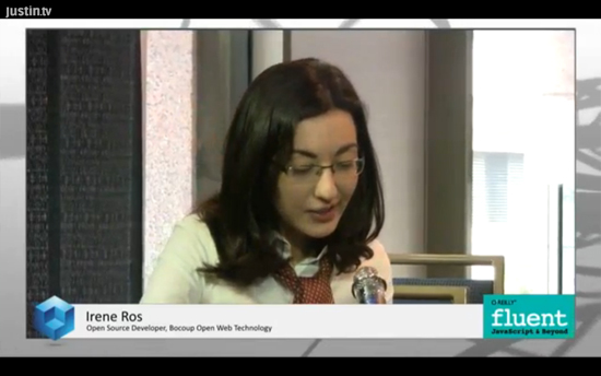
Irene Ros, Data Visualization & Open Source Senior Developer at Bocoup, discussed data visualization trends and best practices with theCUBE host Jeff Frick, live at the 2013 O’Reilly Fluent Conference.
Bocoup does consulting, training, and community development to turn open source into a viable alternative to closed source software, giving it a sustainable future. Ros commented on her conference keynote, initially titled “The ABCs of Data Visualization,” which she ultimately changed to “Architecting Better Charts.”

Reducing & recycling data, tools
“In terms of working with clients, what we found is that we follow a certain pipeline,” Ros said. A lot of time goes into researching data, trying to confirm privacy, determining if there’s a need to harvest more data or transform it. “You never really visualize Big Data, you first reduce it to a smaller subset” that is appropriate for visualization.
There are a lot of tools such as Jquery to organize data, some cleaner than others, Ros said. From an architectural viewpoint, the challenge is “to make charts that are reusable,” which implies repeatability, configurablity (creating APIs for users to build on top of the charts you’ve created) and composability (composing charts from others or “making new things from the old”).
Every choice you make changes data’s narrative
Commenting on hypothesis-driven visualization versus the needle-in-a-haystack approach, Ros pointed out that the patterns one would think were there really weren’t. A lot of times, people want to visualize a particular type of data in a particular type of chart, which does not always work. “Everything is visualization, your Facebook feed is visualization. The range of what you can build is really vast,” she added.
There is an entire process that involves data preparation for visualizing it, to get a mental picture of what the data looks like, exploring the narrative of the data. Data visualization is a story. “Every choice you make is somehow going to impact the viewer when it comes to data visualization. It’s really easy if you look at different visualizations of the data to see how different the narrative is.” The colors you use and other minor details have a big impact.
Tips for data visualization
Asked to share tips and best practices on data visualization, Ros said that visualization is strongly impacted by “the quality of your data: are you capturing it the way you should?” Bocoup works with those developing APIs to gather data correctly. “It’s important to get to a point where you’re comfortable when looking through your data.” She also highlighted the danger of reacting to real time analytics.
“Data science and visualization are becoming so important because there are just so many different applications that come into play, and there’s a lot of overlap,” Ros explained. It’s important not to react in real time to real time analytics unless appropriate. In some situations it is incredibly important to react to real time data – in the medical field, flight control, etc. “But in other cases it’s really less urgent and it’s dangerous to react in real time.”
Support our mission to keep content open and free by engaging with theCUBE community. Join theCUBE’s Alumni Trust Network, where technology leaders connect, share intelligence and create opportunities.
Founded by tech visionaries John Furrier and Dave Vellante, SiliconANGLE Media has built a dynamic ecosystem of industry-leading digital media brands that reach 15+ million elite tech professionals. Our new proprietary theCUBE AI Video Cloud is breaking ground in audience interaction, leveraging theCUBEai.com neural network to help technology companies make data-driven decisions and stay at the forefront of industry conversations.