


 BIG DATA
BIG DATA
BIG DATA

BIG DATA
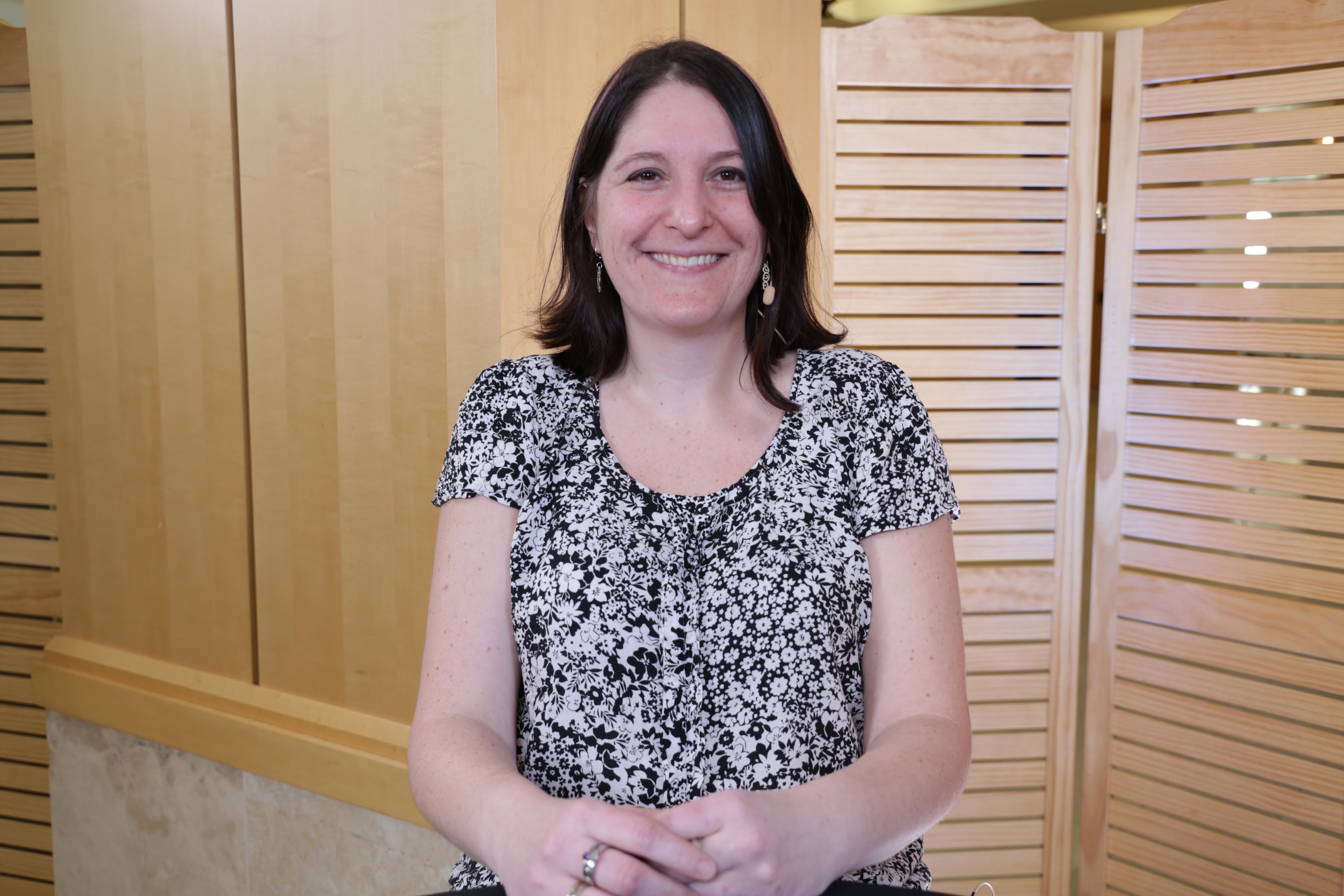
At a French engineering school, Nathalie Henry Riche (pictured) was one of only three women in her graduating class of 300. As a researcher at Microsoft since 2009, Henry Riche believes thought diversity — a variety of cultures, genders, age ranges and backgrounds — are more of a focus to her than just being a minority woman in her field.
“Part of the job I’m doing is very creative, so, we’re trying to come up with new ideas for [data] visualization. I think having a wide range of people adds to the mix, and we get so many more exciting ideas,” Henry Riche said.
The Microsoft Research team member recently spoke with Lisa Martin (@LuccaZara), host of theCUBE, SiliconANGLE Media’s mobile livestreaming studio, during the Global Women in Data Science Conference at Stanford University. They discussed the role of data visualization and data-driven storytelling.
Teaching data science is crucial early on — much earlier than freshman year of college, according to Henry Riche. She tries to teach her own kindergartener the ways to correctly represent data, more than just showing a candy bar as a bar chart illustration.
“[Hopefully] for the next generation to come, they’ll be able to look at a chart and think critically about it — whether or not it tells the right story with the right data,” Henry Riche said.
Having published more than 60 articles on the topics of human-computer interaction and information visualization, Henry Riche explained that data visualization in fact has two “superpowers.”
“The first one enables you to think about your data in a new way … form hypothesis and answer questions you didn’t even know you had, by your data,” Henry Riche explained. “The second super power is, it’s really useful to communicate information and communicate with a large audience. Visualization helps you convey your point with data to back it up.”
Not all data visuals are a success. One of Henry Riche’s projects to visualize French air traffic data in Holland reported one plane doing loops. Looking at the data early on helped Henry Riche’s team detect anomalies in the data set itself.
“What I find very interesting [about] visualization — often people think about it at the end of the spectrum. Like, ‘I’ve collected my data, I analyze it, and now I need a pretty picture to explain what I found.’ But the most powerful use of visualization, I think, comes early on, where you actually just collected your data and you look at it before you run any statistical tests,” Henry Riche concluded.
Watch the complete video interview below, and be sure to check out more of SiliconANGLE’s and theCUBE’s coverage of the Global Women in Data Science Conference. (* Disclosure: TheCUBE is a paid media partner for the Women in Data Science Conference. Neither Stanford University, the event sponsor, nor other sponsors have editorial control over content on theCUBE or SiliconANGLE.)
Support our mission to keep content open and free by engaging with theCUBE community. Join theCUBE’s Alumni Trust Network, where technology leaders connect, share intelligence and create opportunities.
Founded by tech visionaries John Furrier and Dave Vellante, SiliconANGLE Media has built a dynamic ecosystem of industry-leading digital media brands that reach 15+ million elite tech professionals. Our new proprietary theCUBE AI Video Cloud is breaking ground in audience interaction, leveraging theCUBEai.com neural network to help technology companies make data-driven decisions and stay at the forefront of industry conversations.