


 APPS
APPS
APPS
APPS
APPS
More than a decade after Microsoft Corp. introduced the trademark ribbon that frames the top of every core Office 365 application, the option-packed toolbar is about to take on a new form.
The change is part of a broader redesign that the company announced today. Jared Spataro, Microsoft’s corporate vice president for Office and Windows marketing, said the motivation behind the update is to “simplify the user experience” for the billion-plus people who rely on the productivity suite.
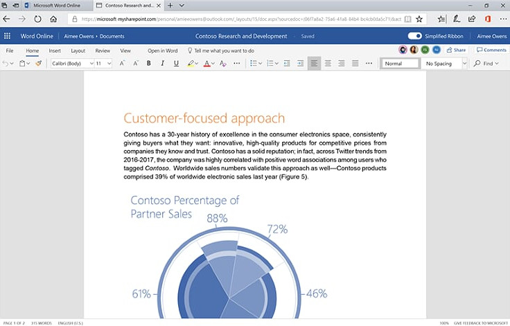
The new ribbon reflects that goal the most among the changes included in the redesign. Microsoft has collapsed the toolbar’s expansive, three-layer layout into a single row (below) that will show the most important feature shortcuts for users. It should make Office 365 feel more similar to Alphabet Inc.’s G Suite, which also boasts a minimalist toolbar.
The change could put Microsoft in a better position to compete for users who prefer a more open document-editing environment, or simply don’t require quick access to Office 365’s more specialized features. At the same time, advanced users will still have the ability to expand the ribbon into the classic three-layer view.
Microsoft’s Spataro wrote that the company will take a “careful” approach to rolling out the new toolbar in order to avoid upending veteran Office 365 users’ usage habits.
“Word, Excel, and PowerPoint for Windows offer our deepest, richest feature set — and they’re the preferred experience for users who want to get the most from our apps,” Spataro wrote. “Users have a lot of “muscle memory” built around these versions, so we plan on being especially careful with changes that could disrupt their work.”
Initially, Microsoft is only releasing the new ribbon for the web version of Word. The company plans to extend the pilot to Outlook next month for select members of the Office Insiders beta testing program. According to Spataro, “we need more feedback from a broader set of users” before the ribbon can be implemented in additional Office 365 applications.
The other changes in new design should take much less time to get used to. Microsoft is refreshing the icon graphics in Office 365 with enhancements such as new animations to give the suite a more modern look, as well as to boost usability. Among the upcoming tweaks are avatars and a new color-coding scheme meant to enhance clarity in documents that contain input from multiple users.
Rounding out the planned changes is an expansion of Office 365’s “zero query search” function. The feature, which generates recommendations for users when they place the cursor on the search bar, will arrive to the web version of Outlook in August. This update comes comes not long after Google started rolling out its new design for Gmail.
Support our mission to keep content open and free by engaging with theCUBE community. Join theCUBE’s Alumni Trust Network, where technology leaders connect, share intelligence and create opportunities.
Founded by tech visionaries John Furrier and Dave Vellante, SiliconANGLE Media has built a dynamic ecosystem of industry-leading digital media brands that reach 15+ million elite tech professionals. Our new proprietary theCUBE AI Video Cloud is breaking ground in audience interaction, leveraging theCUBEai.com neural network to help technology companies make data-driven decisions and stay at the forefront of industry conversations.