 NEWS
NEWS
 NEWS
NEWS
 NEWS
NEWS
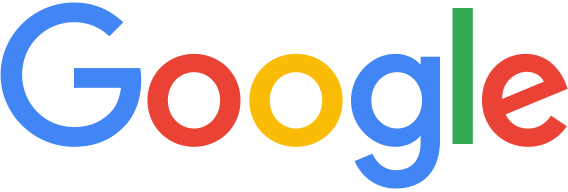
Google has stepped forward Tuesday in its evolution as a brand to great new territory with a “brave” new logo that kicks off Google’s past and encapsulates a new beginning for a company that wishes to do amazingly new things in the decades ahead.
LOL, just joking.
Google has instead simply changed the font for their logo, although at the time of writing it’s only showing in the United States at Google.com and hasn’t been rolled out to other Google properties.
Despite the fact that it sounds like a badly implemented April Fools Day joke, Google confirmed the change in a post to the official Google Blog, noting that the company had changed a lot over 17 years, and that today they’re “changing things up once again.”
“Today we’re introducing a new logo and identity family that reflects this reality and shows you when the Google magic is working for you, even on the tiniest screens,” wrote Google’s whatever that means versus the previous logo that was serif versus the new San-serif design.
“As you’ll see, we’ve taken the Google logo and branding, which were originally built for a single desktop browser page, and updated them for a world of seamless computing across an endless number of devices and different kinds of inputs (such as tap, type and talk)” the post continued, because you know for some magical reason San-serif versus Serif fonts make the whole world of difference.
Because you can never have enough WTF, the justification of how the new logo delivers something amazing continues with “it doesn’t simply tell you that you’re using Google, but also shows you how Google is working for you.”
The justifications from Google for their bizarre change of logo ranges from the contrite to the mentally challenged (presuming that’s a politically correct way of putting it).
It can only be fairly described as change for change’s sake.
“This isn’t the first time we’ve changed our look and it probably won’t be the last, but we think today’s update is a great reflection of all the ways Google works for you” the post from Google added…but can any sane person explain why?
There are circumstances where a brand refresh has validity, be it due to a logo design that has dated poorly, or where a company needs a fresh image due to an ageing, non-relevant brand.
None of those apply with Google.
Perhaps it’s a post-Alphabet, Inc. refresh where the core (original Google) business under the leadership of Sundar Pichai looks to go in different directions or looks to strike out as being different from the other Alphabet companies?
The mind boggles.
Whatever the reason mark September 1st, 2015 as the day Google may have started losing the plot.
Support our mission to keep content open and free by engaging with theCUBE community. Join theCUBE’s Alumni Trust Network, where technology leaders connect, share intelligence and create opportunities.
Founded by tech visionaries John Furrier and Dave Vellante, SiliconANGLE Media has built a dynamic ecosystem of industry-leading digital media brands that reach 15+ million elite tech professionals. Our new proprietary theCUBE AI Video Cloud is breaking ground in audience interaction, leveraging theCUBEai.com neural network to help technology companies make data-driven decisions and stay at the forefront of industry conversations.