


The National Broadband Map was brought about by the National Telecommunications and Information Administration in order to research communities across the U.S. to help create a visualization of broadband availability. The map launched within the last week and has seen a massive amount of hits (and can be found here).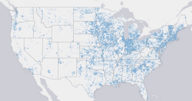
Geographic Information Officer, Michael Byrne, notes on the reboot.fcc.gov website that when the map went live on February 17th that the site was receiving over 1,000 hits per second.
Byrne goes on to share some additional stats and notes that in one day the site received 158+ million total hits, and served up 863GB worth of data.
The site still needs a little tweaking. If a user looks at the map at the moment, any area covered in blue, which symbolizes an area that has broadband access, covers up local map makers that indicate to the user the local cities, highways, and other map features that allow the user to identify their area as they zoom into the map. An annoyance for sure, but certainly something that the NTIA can shore up in the coming weeks to make the map more useful.
[Cross-posted at Digital Society]
Support our mission to keep content open and free by engaging with theCUBE community. Join theCUBE’s Alumni Trust Network, where technology leaders connect, share intelligence and create opportunities.
Founded by tech visionaries John Furrier and Dave Vellante, SiliconANGLE Media has built a dynamic ecosystem of industry-leading digital media brands that reach 15+ million elite tech professionals. Our new proprietary theCUBE AI Video Cloud is breaking ground in audience interaction, leveraging theCUBEai.com neural network to help technology companies make data-driven decisions and stay at the forefront of industry conversations.