

 Data visualization is emerging as the best way to understand the massive data streams and the events in our lives that shape who we are, where we live and the communities that define our interactions.
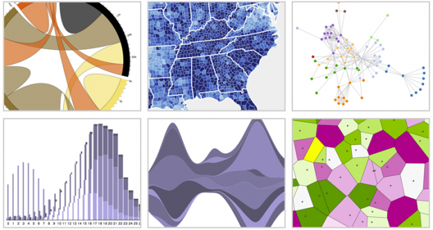
Last week, Flowing Data, one of the best blogs on the topic, featured the best data visualization projects for 2011:
If last year (and maybe the year before) was the year of the gigantic graphic, this was the year of big data. Or maybe we’ve gotten better at filtering to the good stuff. (Fancy that.) In any case, data graphics continue to thrive and designers are putting more thought into what the data are about, and that’s a very good thing.
The post shows how programming and analysis is increasingly baked into perspectives that are woven into mediums as beautiful as they are informative. Here are a few examples.
Th projects Flowing Data features reflect how open-source efforts influence data visualization projects such as the Data Driven Document effort or D3 as it is more commonly known. D3 is a Java script library that Mike Bosworth contributed to GitHub in 2010. The library matured in 2011 as Flash waned in popularity and HTML5 gained better adoption.
Before data became so accessible, statisticians relied quite a bit on U.S. Census data to determine the unique characteristics of a community. Today, we can gain a perspective with open data that gives a wholly different perspective of a community.
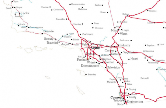
Media artist Roger Luke DuBois shows how we know may look at data to learn more about who we are. DuBois analyzed online dating profiles from 21 dating sites. He then replaced the cities and towns on local, stat and national maps with the words that people from those regions use in their profiles.
From Flowing Data:
Below is a map of southern California, and right on cue: actor, director, television, and entertainment.
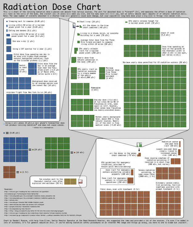
Data gives perspective about natural disasters and the man-made variety such as this radiation dose chart:
Data visualization will become a foundation element of the modern app. We know that mobile devices will become standard for work and personal activities. We can expect that data visualization will also also become standard for apps as the data we consume becomes ever denser and a fundamental way we live and work.
Support our mission to keep content open and free by engaging with theCUBE community. Join theCUBE’s Alumni Trust Network, where technology leaders connect, share intelligence and create opportunities.
Founded by tech visionaries John Furrier and Dave Vellante, SiliconANGLE Media has built a dynamic ecosystem of industry-leading digital media brands that reach 15+ million elite tech professionals. Our new proprietary theCUBE AI Video Cloud is breaking ground in audience interaction, leveraging theCUBEai.com neural network to help technology companies make data-driven decisions and stay at the forefront of industry conversations.