


 APPS
APPS
APPS
APPS
APPS
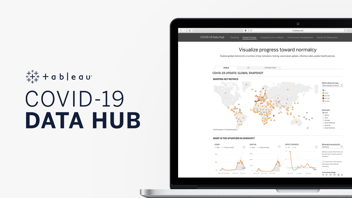
Tableau Software LLC, a Salesforce.com Inc. company, today announced the launch of a new COVID-19 Data Hub and global tracker with a data visualization dashboard for cases, deaths, infection rates, testing, vaccination rates, contact tracing, testing eligibility, economic impact and more.
This data tracker is designed to give governments, businesses, humanitarian groups and other organizations in-depth visualization into publicly available COVID-19 data they need to understand to make effective decisions.
“With the gradual rollout of vaccines, the coronavirus pandemic has entered a new phase,” said Jeremy Blaney, Tableau’s director of Global COVID-19 Data Hub and project manager. “Yet progress cannot be measured simply by tracking the number of vaccinations. In order to make the right decisions on the path to recovery, it’s critical we have a more nuanced understanding of the factors related to the spread of the disease.”
Although all of the data on COVID-19 that the tracker uses may exist in the public domain, it’s incredibly messy, hard to get and difficult to understand and thus digest, Blaney explained to SiliconANGLE. That’s where Tableau’s product comes into play.
According to Blaney, the biggest challenge of bringing all of this data together is that not all of this data is structured the same and not all of it is complete. In order to put this together, the Tableau Global Tracker team needed to produce its own pipeline to ingest the data, which required its own application programming interface to connect to different systems across the world.
The team also assembled its own advisory board to pick out relevant and trustworthy sources from across the globe. Those sources would then need to be normalized to map to the same indexes so they could be certain the data would all be describing the same information and to avoid duplicating data.
Equally important, the dashboard itself is a visualization system that attempts to tell a story with the data, turning what is a barrage of numbers and statistics into something elegant and understandable. Using filters, graphs and visual representations of data alongside geographic localities and COVID-19 information, narratives emerge that otherwise might get lost in spreadsheets or other reports.
Visually, the dashboard uses squares instead of fill-in maps to display data. This way, smaller countries don’t vanish from view at the most zoomed-out view. Aesthetic choices were also made to accommodate colorblind users when determining heat maps for differentiating intensity. Beneath the maps are graphs displaying COVID-19 cases, deaths, positivity rates, vaccination rates, coverage, tests and other vital stats.

Image: Tableau
The tracker has already been put to use by Verizon Communications Inc. to amplify its own customer service during the pandemic. Verizon created a COVID-19 impact dashboard to identify geographic areas requiring service and used location-based analytics to identify areas that would need extra attention and adjust resources accordingly.
Another use case involved integrated health care system UNC Health’s analytics team, which used Tableau’s dashboard to direct data-driven decisions based on testing, utilization, PPE inventory, available bed space and supply chain inventories. Clinical teams and hospital administrators also used the data to rank vulnerability for patient cases and manage care delivery priorities using the dashboard in other use cases.
The system can also be used by human resources at businesses now that vaccines beginning to roll out worldwide to make office staffing decisions. Although remote work has become the norm to keep office workers safe, some offices are beginning to wonder when to bring workers back again. Even with vaccinations, social distancing, mask-wearing and increased employee hygiene, it may not always be safe to do so, and the tracker could provide a strong predictor of when it might be safe to return and when to do so.
Tableau has a wide variety of COVID-19 resources available to businesses, governments and other organizations including the new COVID-19 Data Hub and a workbook, all updated daily on its website.
Support our mission to keep content open and free by engaging with theCUBE community. Join theCUBE’s Alumni Trust Network, where technology leaders connect, share intelligence and create opportunities.
Founded by tech visionaries John Furrier and Dave Vellante, SiliconANGLE Media has built a dynamic ecosystem of industry-leading digital media brands that reach 15+ million elite tech professionals. Our new proprietary theCUBE AI Video Cloud is breaking ground in audience interaction, leveraging theCUBEai.com neural network to help technology companies make data-driven decisions and stay at the forefront of industry conversations.